Water network operators don’t have time to waste figuring out complicated software.
When a pressure zone drops or a leak alert comes in, they need answers now, not after digging through layers of menus and charts. But people who’ve never spent a day in an operations center built too many of these water management systems.
The result? Tools that look impressive in demos but slow teams down when it counts.
The Real Challenge Isn’t Data, It’s Clarity
Most water utilities already have data. Pressure readings, flow rates, consumption patterns, leak detection alerts. The sensors are working. The systems are collecting data.
The problem is what happens next.
Operations teams open their dashboard and see everything at once. Too many metrics, too many graphs, too many alerts competing for attention.
Where do you start? Which alert matters most? What action should you take first?
It’s not that operators lack technical skills. It’s that designers built the tools without understanding how water networks actually operate.
What Operators Actually Need
Talk to any experienced network operator. They’ll tell you they need to spot problems fast and know what to do about them.
That means a dashboard should answer three questions in seconds:
- What’s happening right now?
- What needs my attention?
- What should I do next?
Everything else is secondary.
When water utilities simplify their operations dashboard, teams respond to issues faster. Not because they hired new staff or installed better sensors. They just stopped wasting time trying to interpret their own system.
The change is straightforward. Instead of showing every data point at once, the dashboard highlights only what matters for that specific moment.
Normal operations? You see a clean overview. Anomaly detected? The relevant zone, the affected pipes, and the recommended action appear front and center.
How Simple Design Creates Better Outcomes
A simple water network management dashboard organizes data so water network operators can act quickly and confidently.
Start with what’s normal
When everything’s running smoothly, you don’t need to see dozens of charts. A clean status overview is enough. Green zones stay green and key metrics stay within range.
Surface issues clearly
When something changes, the dashboard should make it obvious. A pressure drop in District 3? That zone moves to the top. Flow pattern looks unusual? You see which pipes have the problem and what similar events looked like in the past.
No detective work required. Just clear information about what changed and where.
Guide the next step
This is where most dashboards stop, but it’s where operators need the most help. Seeing a problem is one thing. Knowing whether to dispatch a crew, adjust a valve, or monitor for ten more minutes is another.
Better dashboards connect the data to practical next steps. The dashboard flags when pressure drops from normal demand increases. If the pattern matches previous leak incidents, that context appears too.
What This Looks Like in Practice
A medium-sized utility managing 800 kilometers of pipe used to spend two hours each morning reviewing overnight data. Their team would open multiple screens, cross-reference reports, and compile a priority list for the day.
The team switched to a simpler dashboard built for decision-making. Their morning review dropped from two hours to 20 minutes. The data was the same. The presentation made the difference.
Night shift logs? Automatically summarized with only the unusual events highlighted. Maintenance priorities?
Already ranked by urgency and available crew capacity. Historical context? Right next to current readings, so operators immediately know if this situation is routine or concerning.
A water operations manager put it simply: “We stopped analyzing our dashboard and started using it.”
The Features That Actually Matter
When you strip away the noise, a useful water network management dashboard needs just a few core elements done really well.
Real-time overview without overload
Current status across the network, but organized by what needs attention rather than geographic zones. You should see urgent issues first, then warnings, then routine operations.
Context that explains the numbers
A pressure reading of 45 PSI means nothing without knowing if that’s normal for that zone at that time. Good dashboards show the number and tell you if it’s normal, trending up or down, and different from last week.
Clear priorities
Multiple alerts competing for attention create confusion. The dashboard should help operators decide what to handle first based on potential impact, not just timestamp order.
Quick access to details when needed
Sometimes operators need to dig deeper. That option should be one click away, not buried in submenus. But it shouldn’t clutter the main view for 90% of situations where the summary is enough.
Why This Matters for Your Team
Complicated dashboards don’t just waste time. They increase the chance of missing important signals. They delay response to real issues.
Teams miss important signals and respond slower to real issues. Even experienced operators burn out when they know what they need but can’t find it quickly.
Faster response to issues
Less time navigating means more time acting. When a leak alert appears, operators see the location, estimated severity, and nearby infrastructure in one view. Operators dispatch crews while other systems are still loading their maps.
Better decisions under pressure
Critical situations require quick thinking. Clear data leads to better decisions. Operators don’t hunt for the right report. They don’t scan through graphs looking for answers.
Easier training for new staff
Complex systems require extensive training. Simple dashboards guide new operators to the right data and actions. They get productive faster.
Less operator fatigue
Mental load adds up. Spending all day parsing complicated interfaces is exhausting. When the dashboard does the organizing work, operators can focus their energy on actual problem-solving.
Moving From Complexity to Clarity
Many water utilities inherit their management systems. They add features over years, integrate new sensors, and layer on new capabilities. Teams added features that made sense at the time. The dashboard now tries to do everything and helps no one.
Simplifying doesn’t mean starting over. It means rethinking what data operators truly need moment to moment, then redesigning the interface to deliver exactly that.
The best part? This often reveals that you already have the right data. You just need to present it differently.
What to Look for in a Water Management Dashboard
If you’re evaluating new systems or considering changes to your current setup, prioritize these characteristics:
Designed for operators, and administrators
Some dashboards are built for executives only to review monthly reports. Other dashboards serve engineers analyzing trends. The efficient dashboard should serve both people who are running the network every day. And the top management to review monthly reports and the impact of operators’ work.
Configurable without being overwhelming
Operators have different preferences. Some want more detail on certain zones. Others prioritize different metrics. The dashboard should adapt to individual workflows without requiring everyone to learn complex setup tools.
Mobile access when needed
Not every situation happens at a desk. Field staff check status and respond to alerts from their phones. Core features should be right there, not hidden in menus.
Integration that actually works
Your dashboard should pull from existing sensors and systems without creating data silos. If your team needs three different tools to get a complete picture, something’s wrong.
The Shift That Makes This Possible
The move toward simpler, more effective dashboards isn’t about lowering expectations or dumbing down the technology. It’s about focusing the technology on what matters.
Water networks are complex. The tools for managing them don’t need to mirror that complexity. In fact, the best tools hide the complexity, showing operators just what they need to keep the system running smoothly.
The right dashboard changes everything. Teams respond faster. They make better decisions. They’re more satisfied with their work.
Your network operations deserve tools that help rather than hinder. Sometimes the most powerful improvement is making things simpler.
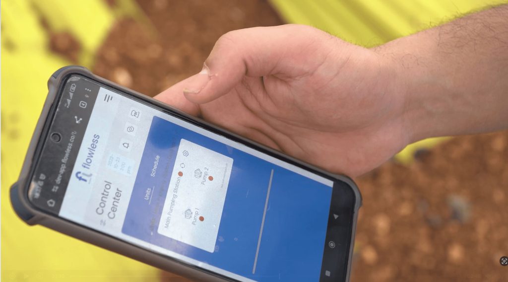
Ready to give your team a dashboard that actually helps them work faster? See how Flowless simplifies water network management.

Aya Bozia
Flowless CMO